How to Balance Form and Function in Product Design
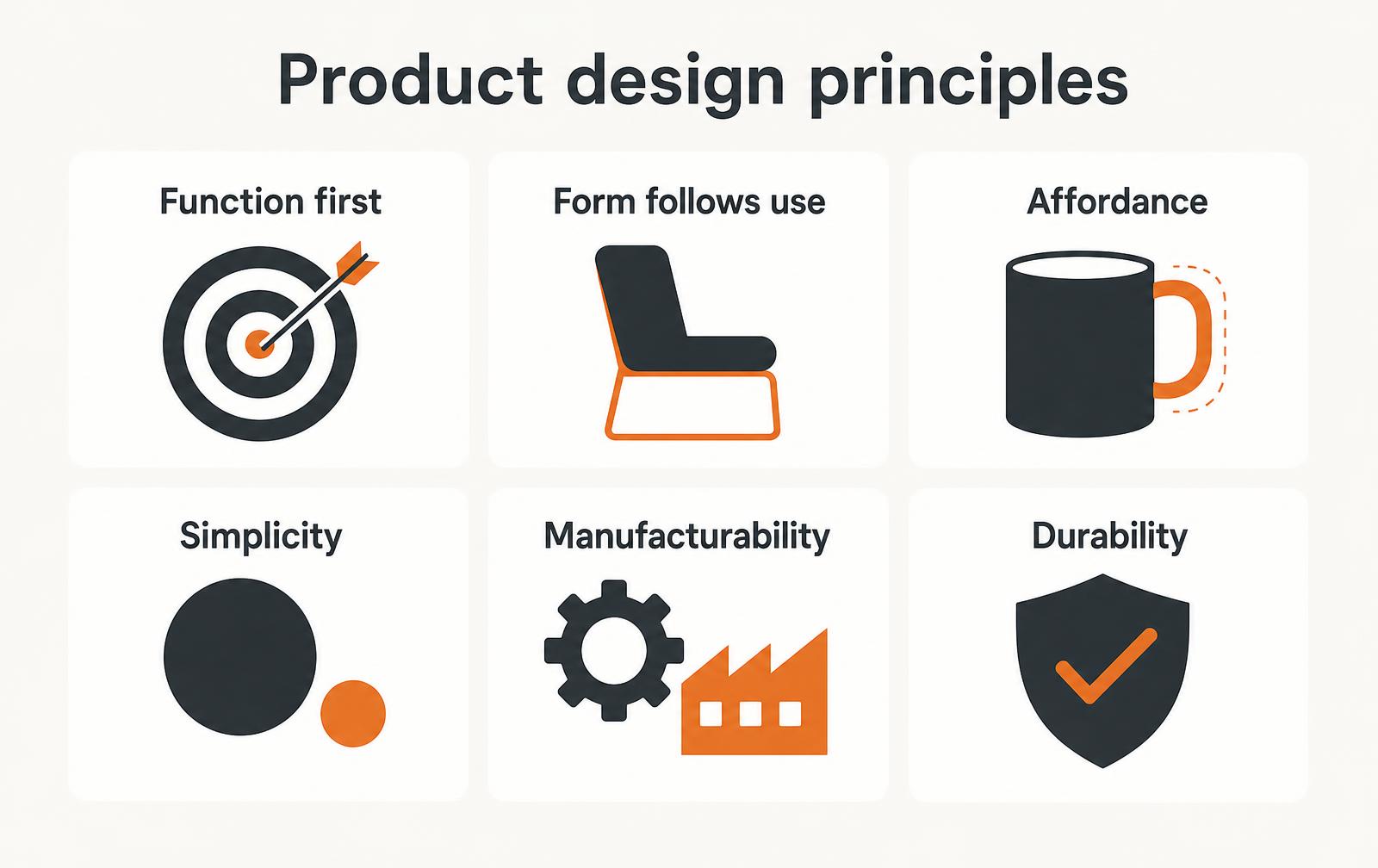
Function first, form follows use, affordance, simplicity, manufacturability, durability - the principles that decide whether a product survives contact with users and tooling.
May 18, 20237 min read

Written by Konstantin Dolgan, Ph.D., NPDP
Founder & CEO, Product Development Engineer
Published May 18, 2023Updated September 2, 2026
Balance form and function by deciding the order of priority before you style anything: function, then usability, then manufacturability, then form. When two of them collide, the one that changes whether the product works or sells wins, and the trade-off gets written into the specification rather than settled by taste. The table below shows the default resolution for the conflicts that come up on almost every program, and the six principles that follow explain how to apply them.
When form and function conflict: who wins
Conflict | Default resolution |
|---|---|
Thinner form vs. structural stiffness | Function wins; add ribs and revisit the surface |
Seamless look vs. serviceability | Depends on price tier; state the choice in the spec |
Distinctive shape vs. tooling cost | Quantify the cost per unit before deciding |
Extra feature vs. simplicity | Cut the feature unless it changes the purchase decision |
1. Function first
Write the functional specification before the first sketch: what the product must do, to what measurable standard, in what environment. A beautiful object that fails its core job is returned; a plain object that does the job reliably gets recommended. Form is applied to a working concept, not negotiated with it.
Most of these decisions are easier when the requirements were written down first - see how to write a product design brief.
2. Form follows use, not fashion
"Form follows function" is usually quoted as an aesthetic. In practice it means the geometry should be driven by how the product is held, mounted, cleaned and stored. Watch users handle a prototype for an hour and the correct radii, grip zones and orientation cues become obvious - and none of them come from a mood board.
3. Affordance: the product should explain itself
- The correct grip should be the most comfortable one.
- Assembly should only be possible in the right orientation.
- Controls should look like what they do - a dial to rotate, a flat to press.
- Status should be readable from normal viewing distance, not just up close.
- If a label is needed to explain a basic action, the geometry is doing too little.
4. Simplicity: fewer parts, fewer failures
Decision | Cheap-looking shortcut | Better simplification |
|---|---|---|
Housing | Split into more parts to ease molding | Combine parts and add draft and living hinges |
Fasteners | Mixed screw sizes across the assembly | One screw size, one driver, fewer SKUs |
Interfaces | Custom connector for a standard signal | Standard connector, standard cable |
Finishes | Multiple textures to hide flow lines | One texture that tolerates the process |
5. Manufacturability is a design principle, not a review
Wall thickness, draft, undercuts, tolerance stacks and fastening strategy all belong in the concept phase. Retrofitting them after the form is frozen is how programs lose six weeks and a tool revision. Our design for manufacture guide covers the checklist in detail.
6. Durability and repair
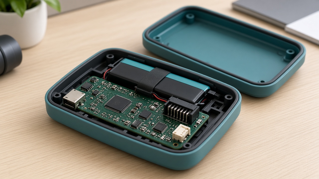
Design the failure modes you can predict: the hinge that cycles, the port that gets yanked, the surface that gets dropped. Decide which parts are serviceable and which are sealed, and make that decision visible in the fastening strategy. Products that can be opened by a technician generate far cheaper warranty outcomes than ones that can only be replaced.
Where the principles actually get tested: the concept review
Principles are cheap in a sketchbook and expensive at the tool shop. The moment they earn their keep is the concept review — the meeting where an appealing form has to justify itself against wall thickness, draft, tolerance stack and assembly time. Teams that hold that review once, late, ship compromised products; teams that hold it three times, early, ship products where form and function were never in opposition.
The cost of changing a design climbs by roughly an order of magnitude at each gate. That curve, not taste, is why the sequencing of design principles matters more than the principles themselves.
Stage | Typical cost of one geometry change | What is still cheap to change | What is already locked |
|---|---|---|---|
Concept sketch | Hours of design time | Architecture, part count, user interaction | Nothing |
CAD, pre-DFM | 1-3 days of engineering | Wall sections, ribs, fastening strategy | Overall size and layout |
Prototype validated | 1-2 weeks plus new prints | Cosmetics, textures, minor ergonomics | Architecture, interfaces |
Tooling cut | $3k-$30k per insert change | Texture, colour, labelling | Geometry, parting lines, draft |
Post-launch | Tooling plus field stock plus recertification | Packaging, documentation | Nearly everything |
Rank the principles before the argument starts
Every design team eventually meets a conflict where two principles are both right. The failure is not the conflict; it is resolving it by seniority in the room.
Agree the ranking during kickoff, write it down, and apply it consistently: safety and regulatory compliance first, core function second, manufacturability third, cost fourth, aesthetics fifth — with the explicit exception that aesthetics can outrank cost where the product's premium positioning is the business case.
Conflict | Wrong default | Better resolution | Test that settles it |
|---|---|---|---|
Seamless look vs. serviceability | Glue everything | Hidden fasteners or snap plus screw boss | Can a technician open and reclose it twice? |
Thin, elegant wall vs. stiffness | Increase wall globally | Local ribs, gussets, section changes | FEA deflection under 1 mm at rated load |
Single moulded part vs. tool cost | Add side actions | Split the part along a natural line | Tool quote difference vs. assembly cost per unit |
Unique fastener vs. supply chain | Custom part | Standard fastener plus custom retainer | Second-source availability in 6 weeks |
Brand colour vs. UV stability | Match the swatch | Pigmented resin with UV package, retest | 500 h QUV, ΔE under 3 |
Function first, measured — not asserted
"Function first" only guides anything when the function has numbers. Before concepts are drawn, write the specification as measurable acceptance criteria: force, time, capacity, temperature range, duty cycle, drop height, noise. A concept then wins or loses against evidence rather than preference, and the industrial designer gets a real envelope to work inside instead of a vague brief.
- State each requirement with a value, a unit, a tolerance and a verification method — 'lightweight' is not a requirement, '840 g maximum, verified on production-intent parts' is.
- Separate must-haves from nice-to-haves before concepts, not after; the second list is where scope creep hides.
- Capture the use environment: temperature, humidity, chemicals, gloves, sunlight, vibration. Most field failures trace to an environment nobody wrote down.
- Define the worst credible misuse and design against it — products are used by tired people in bad light.
- Record the target landed cost and the target assembly time per unit as requirements, not aspirations.
Affordance: the geometry should teach the user
A well-designed part communicates its own use through shape, texture and constraint. Where a label is required to prevent a mistake, the geometry has already failed. The strongest affordances are physical impossibilities — an asymmetric connector that cannot be inserted backwards costs nothing in production and eliminates a whole class of support calls.
User question | Weak answer | Strong answer |
|---|---|---|
Which way up? | Printed arrow | Asymmetric footprint or keyed feature |
Where do I hold it? | Colour block | Recessed grip with matching texture |
Is it on? | Small LED | Illuminated control plus tactile detent |
Did it seat? | Instruction sheet | Audible click and flush surface |
Which end is the front? | Logo placement | Directional taper and control cluster |
Design for manufacture as a concept-stage activity
Manufacturability is not a review gate that happens to the design; it is a set of decisions taken while the design is still fluid. Uniform nominal wall, generous draft, ribs at 60 percent of wall, radii on every internal corner, self-locating features on mating parts, tolerances only where function requires them: applied at concept, these cost nothing. Applied after tooling, they cost weeks.
Guideline | Injection moulded ABS/PC | Sheet metal | CNC machined aluminium |
|---|---|---|---|
Nominal wall | 2.0-3.0 mm, uniform | 1.0-2.0 mm sheet | 3 mm minimum for stiffness |
Draft | 1-1.5° per side, 3° on texture | n/a | n/a |
Internal radius | 0.5 x wall minimum | 1 x thickness bend radius | Match to standard cutter, 3 mm typical |
Rib thickness | 50-60% of wall | n/a | n/a |
Standard tolerance | ±0.15 mm typical | ±0.25 mm on formed features | ±0.05 mm achievable |
Hole to edge | 1.5 x diameter | 2 x thickness | 1 x diameter |
A concept review checklist that finds the expensive problems
- Walk the assembly sequence out loud, part by part, and time it — if a step needs three hands, redesign the fixture feature now.
- Identify the parting line on every moulded part and confirm the cosmetic surface does not cross it.
- Count fasteners and fastener types; every type removed pays back across the entire production run.
- Check the tolerance stack on the two interfaces the user can see and the one that carries load.
- Name the second source for every custom component; single-sourced custom parts are schedule risk disguised as savings.
- Confirm the service story: what fails first, who replaces it, and how they get to it.
- Sanity-check regulatory scope early — EMC, safety, materials contact and labelling all constrain geometry.
More questions teams ask
How do you keep aesthetics from being cut in the name of cost?
Make the aesthetic requirements as concrete as the engineering ones: named surface finishes, allowed gap and flush values, colour tolerances in ΔE, and a defined A-surface. Vague aesthetic intent is always the first thing traded away, because nobody can prove it was lost.
At what point should manufacturing engineering join the project?
At concept, not at CAD release. The decisions that set 70 to 80 percent of unit cost — part count, material family, process choice, assembly architecture — are all made before detailed design begins.
Is a physical prototype still necessary when simulation is this good?
Yes. Simulation predicts stiffness, thermal behaviour and flow well; it does not predict how a real hand grips a real texture, or how an assembler improvises when a clip is hard to reach. Use simulation to reduce prototype rounds, not to eliminate them.
How many concepts should a team generate before converging?
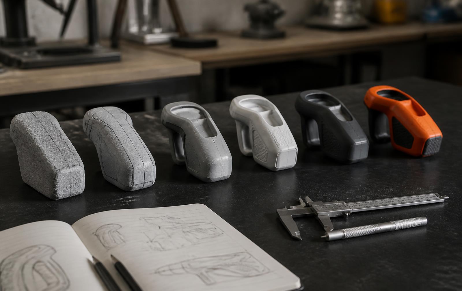
Enough that the team has to reject good ones. In practice fifteen to thirty rough concepts, filtered to three for evaluation and one for development, is the pattern that consistently avoids anchoring on the first idea.
Product design principles in conflict: a worked example
Principles only matter when two of them disagree. A handheld outdoor device is the classic case: the industrial designer wants a seamless shell with no visible fasteners, the electrical engineer wants a serviceable battery, and the operations lead wants a part that comes off a two-plate tool without side actions. All three positions are defensible. The job is not to declare a winner by seniority but to price each option and pick with the numbers visible.
Option | Form impact | Function impact | Unit cost delta | Tooling delta |
|---|---|---|---|---|
Bonded seamless shell | Best | Battery not user-serviceable | -$0.40 | Baseline |
Hidden snap-fit with service hatch | Good | User-serviceable in 20 seconds | +$0.65 | +$4,800 (side action) |
Visible screws, gasketed | Weakest | Fully serviceable, best sealing | +$0.22 | Baseline |
Once the trade-off is on one page, the discussion changes from taste to policy. If the product is sold through a channel that handles returns, serviceability usually wins; if it is a sealed consumer accessory with a two-year life, the bonded shell wins. Either answer is correct as long as it is written down with the reasoning, because the next engineer to open the file will otherwise re-litigate it.
How to balance form and function on a real schedule
- Rank the principles before concepts exist. Write an ordered list — safety, core function, usability, manufacturability, form — and get it signed by whoever owns the budget.
- Give form a measurable target. Rather than "premium feel", specify wall flatness, parting-line placement and maximum gap so the aesthetic goal can pass or fail a check.
- Cost every deviation. Any concept that breaks a lower-ranked principle must carry a unit-cost and tooling number in the review packet.
- Freeze the ranking at design lock. After tooling release, form changes are paid for in weeks, not opinions.
- Record the rejected options. A one-line rationale per rejected concept prevents the same debate at design verification.
Key takeaways
- Product design principles are a ranking exercise, not a checklist — conflicts are the point.
- Form goals become useful only when they are written as measurable targets.
- Every trade-off should carry a unit cost and a tooling cost before the review.
- Document rejected options so the decision survives staff changes.
Frequently asked questions
What are the main product design principles?
Function first, form driven by real use, clear affordance, simplicity, manufacturability and durability. Together they cover whether the product works, whether people understand it, and whether it can be made at the target cost.
Does form follow function in product design?
Mostly, but not absolutely. Function sets the constraints; within those constraints form carries brand, perceived quality and price positioning - all of which affect whether the product sells.
How do design principles affect manufacturing cost?
Design decisions lock in roughly 70 to 80 percent of unit cost before tooling is cut. Part count, material choice, tolerance and finish drive that cost far more than negotiating with a supplier later.
Who should apply these principles?
Industrial design, mechanical engineering and manufacturing engineering together, in the same reviews. Applied by one discipline alone they become preferences; applied jointly they become decisions. Work with LA NPDT: if you are moving from here to execution, start with our product design services or talk to us about industrial design and development .
Filed under:EducationInspirationWords
Services related to this guide
- Product design servicesIndustrial design and CAD taken all the way to manufacturable files.
- Best industrial design firmsWhich studios take an idea from form to manufacturable hardware, and what they charge.
- Prototype designLooks-like, works-like or pre-production: what each proves and what it costs.
- Product development examplesReal projects we designed, prototyped and shipped.