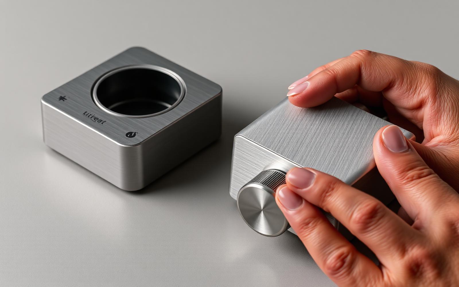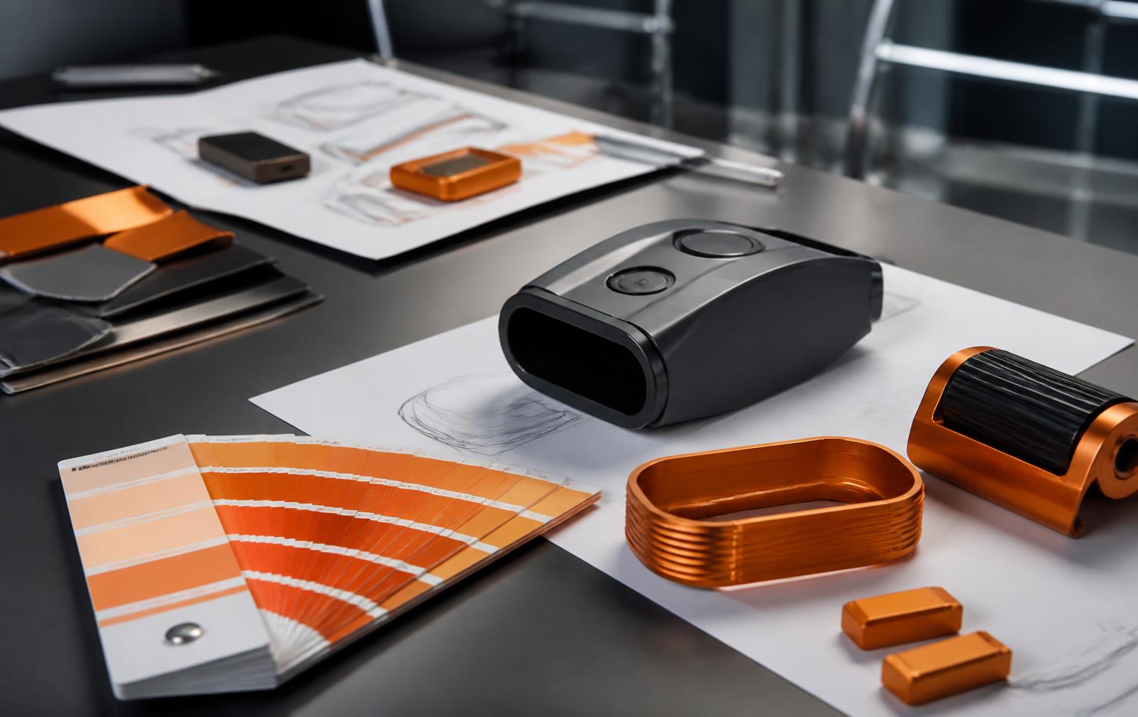
Brand Color Psychology: Why We Chose Orange
Color does not carry a fixed meaning — it sets an expectation your product then has to meet. Here is how brand color psychology works for physical products, and why our own brand is orange.
January 9, 20177 min read

Written by Yelena Rymbayeva, MPhil Communication & Media Studies, BTech Quality Control
Marketing & Product Leader, Technology Commercialization
Published January 9, 2017Updated September 2, 2026
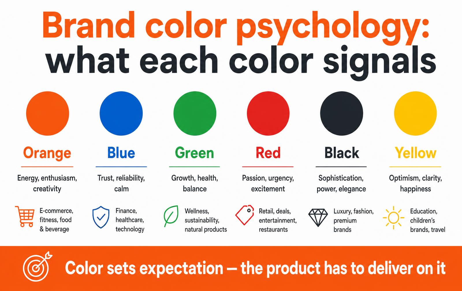
Brand color psychology is not a lookup table of fixed meanings. Color sets an expectation about what a brand or product will be like, and the rest of the experience either confirms it or makes it feel dishonest. That is the useful version of the idea: choose a color for the expectation you can actually deliver, then keep it consistent long enough for people to learn it.
What the research actually supports
Studies on color and consumer behavior converge on a modest, reliable finding: color strongly affects whether a brand feels appropriate for what it sells, and only weakly predicts emotion on its own.
Blue does not make people trust a company; blue is common in finance and healthcare, so a blue medical device reads as normal and a hot pink one reads as a statement that has to be justified. Fit with the category, and consistency over time, do most of the work that people attribute to the color itself.
Color signals by category
Color | Usually signals | Common categories | Risk when misapplied |
|---|---|---|---|
Orange | Energy, accessibility, creativity, action | Tools, sport, food, challenger brands | Can read as budget or loud in premium categories |
Blue | Reliability, calm, competence | Medical, finance, enterprise software | Invisible — the safest and most crowded choice |
Green | Health, growth, environmental claim | Outdoor, wellness, sustainable goods | Invites greenwashing scrutiny you must survive |
Red | Urgency, power, appetite | Food service, performance, retail promotion | High arousal; also the universal warning color |
Black | Precision, premium, restraint | Audio, luxury, professional equipment | Unforgiving on surface finish and fingerprints |
Yellow | Optimism, visibility, caution | Children, safety equipment, discount retail | Poor contrast for text; fades fastest outdoors |
Context beats the color wheel
- Category convention. The meaningful decision is usually whether to match the category or deliberately break from it. Both are valid; drifting into a color by accident is not.
- Culture. White reads as purity in much of the West and as mourning in parts of East Asia. Check every market you intend to sell in before you commit.
- Function. On equipment, color is also information. Safety orange, warning yellow and emergency red are regulated conventions in many contexts and should not be used decoratively.
- Environment. A color chosen on a calibrated monitor will look different under warehouse fluorescents, retail spotlights and daylight. Evaluate physical samples where the product will live.
- Accessibility. Roughly one in twelve men has some form of color vision deficiency. Never encode critical status in color alone.
Color has to survive manufacturing
This is where brand color psychology meets physics, and where a lot of brand books quietly fail. A screen color is emitted light; a product color is pigment on a specific material, under specific lighting, made in batches by more than one supplier.
- Specify to a physical standard. A Pantone or RAL reference plus an approved master sample beats a hex code in a PDF.
- Set a tolerance. Define an acceptable color difference and the lighting used to judge it, so accept or reject is not an argument on a factory floor.
- Watch material shifts. The same pigment reads differently on ABS, on powder-coated steel and on anodized aluminum. Approve a sample per material and process.
- Plan for UV. Saturated oranges, reds and yellows fade fastest outdoors. Ask for UV-stabilized resin and accelerated weathering data if the product lives in sunlight.
- Bright colors cost more. Strong pigments, opaque light colors over dark substrates and extra coats all add unit cost and cycle time.
Why our brand is orange
We are a new product development company, and our work is the messy, energetic middle of the process: sketching, arguing, prototyping, breaking things on purpose and building them again. The engineering consultancies around us mostly picked blue and grey, which signal caution. Caution is not what a founder needs from a development partner at the moment an idea is still fragile.
Orange signals momentum and approachability, it survives on a workshop wall and on a screen, and it differentiates us in a category that had converged on a single palette. Our logo — three orange circles, one empty, one half full, one full — carries the same idea: ideation, development, launch. Empty becomes full because someone did the work.
Choosing a brand color in five steps
- Write the promise first. Three words your brand must communicate. Color choices without a written promise become taste arguments.
- Map the category. Put competitor colors on one board. Decide consciously whether you are joining or leaving that cluster.
- Test in context. Judge candidates on the actual product, packaging and screen — not on a moodboard where every color looks good.
- Check the constraints. Cultural meaning in target markets, accessibility contrast, regulated safety colors, manufacturability in your materials.
- Then commit and repeat it. Recognition comes from years of consistency. Changing the palette every rebrand throws away the only asset color actually builds.
Testing a color before you commit
Brand color decisions usually get made in a conference room looking at a projector, which is the worst possible viewing condition. Before a color goes into a logo, a housing and a package, put it in front of people the way they will actually encounter it: small, on a phone, next to competitors, and physically in hand under the lighting of the place it will be sold or used.
- Shelf test. Print the packaging at real size and put it among competitor products. Recognition at three meters matters more than beauty at arm's length.
- Thumbnail test. Render the logo at 32 pixels. If the color muddies or the mark becomes a blob, the palette is too subtle for digital use.
- Material test. Mold or paint the color on the actual resin, powder coat or anodize you plan to ship. Orange in ABS, orange in nylon and orange on anodized aluminum are three different colors.
- Accessibility test. Check contrast ratios against your text colors and verify that the color is not the only signal carrying meaning for color-blind users.
- Aging test. Expose samples to UV and cleaning chemicals. Warm colors, oranges and reds especially, fade first.
Where the brand color belongs in a product
Surface | Use brand color? | Reason |
|---|---|---|
Full housing | Rarely | Ages badly, limits line extension, raises resin cost and scrap risk |
Grips, buttons, accents | Yes | Reads as intentional, cheap to change, survives product variants |
Packaging | Yes, dominant | Shelf recognition is the packaging's whole job |
UI primary action | Yes, sparingly | One accent color makes the next step obvious |
Warning and error states | No | Safety signals belong to established convention, not to branding |
Keeping the color consistent as you grow
A brand color only compounds in value if it stays the same across years, suppliers and media.
That requires a small amount of boring documentation: reference values for print, screen and physical material. An approved master sample held by both you and the supplier. A stated tolerance and the lighting used to judge it. And a named person who signs off color on first articles.
Without that, drift is guaranteed — every vendor matches to their own interpretation and five years later nothing in the catalog matches.
- Record the color as a physical standard plus digital values, not as a hex code alone.
- Re-issue master samples annually; plastic reference chips fade too.
- Specify color in the drawing package, not in an email to the vendor.
- Check color at first article on every new tool, resin lot or coating supplier.
Color, form and material get decided together, which is why we handle them inside industrial design rather than as a branding exercise bolted on at the end.
Frequently asked questions
Does brand color really influence buying decisions?
It influences the fast judgment about whether a brand suits what it sells, which shapes attention and recognition. It does not override price, function or reviews. Treat color as an amplifier of a coherent product story rather than a lever that moves sales on its own.
How many colors should a brand palette have?
One dominant color, one or two neutrals and a single accent covers nearly every case. Add semantic colors for success, warning and error states in software. Large palettes look flexible in a brand book and dilute recognition everywhere else.
Should the product be the same color as the logo?
Usually not, and rarely across the whole surface. A neutral body with the brand color used on a grip, a button, a seam or the packaging tends to age better, cost less to produce and stay recognizable across a growing product line.
Can a color be trademarked?
In some jurisdictions a single color can be protected for a specific category once it has acquired distinctiveness through long, exclusive use, and it cannot be functional. It is a high bar and a legal question, not a design decision — but it is a reason to keep the color consistent from the start.
Specifying color so it survives production
Brand color psychology gets undone by manufacturing reality. The same nominal color reads differently in molded plastic, on printed carton, in powder coat and on a screen — and every one of those has its own tolerance. Specifying the color properly, with a standard and a tolerance, is what keeps a brand recognizable across parts made in different places.
Color specification by process
Process | Specify with | Typical tolerance | Watch out for |
|---|---|---|---|
Injection molded plastic | Approved color chip in the actual resin | Delta E 1.0-2.0 | Resin change shifts the color |
Printed packaging | Spot color plus proof on the real substrate | Delta E 2.0 | Uncoated stock dulls the color |
Powder coat / paint | Coating supplier code and gloss level | Delta E 1.0-2.0 | Gloss changes perceived hue |
Anodized metal | Sample-approved batch range | Wider, batch dependent | Alloy variation shifts the shade |
Textiles | Lab dip approval | Delta E 2.0+ | Fading over time |
Screens and web | Hex plus profile | N/A | Cannot match physical color exactly |
Approve physical masters and retain signed samples on both sides. When a later production lot drifts, the retained sample is the only objective reference that settles the argument quickly.
Color control checklist
- Approve a physical master in the actual material and process.
- Write a numeric tolerance into the drawing or purchase order.
- Retain signed samples with dates at both your site and the supplier's.
- Re-approve whenever resin, substrate or supplier changes.
- Evaluate color under standardized lighting, not office fluorescents.
Key takeaways
- A brand color must be specified per process, with a numeric tolerance.
- Approve physical masters in the real material and keep signed retains.
- Any resin, substrate or supplier change requires re-approval.
From the archive
Need brand and product color that holds up in production?
Work with LA NPDT: if you are moving from here to execution, start with our our product development process or talk to us about end-to-end product development.
Filed under:Inspiration
Tagged:IdeaIdea MarketingIdeationInnovationLouisianaMarketingMarketing PlanNew Product DevelopmentProduct DesignProduct DevelopmentProduct LaunchProduct MarketingPrototypingRoad GearShreveportWomen Bikers
Services related to this guide
- Product design servicesIndustrial design and CAD taken all the way to manufacturable files.
- Rapid prototypingWorking prototypes in days, from 3D printing to vacuum casting.
- Electronic design servicesSchematic, PCB layout, firmware and bring-up, through to production handoff.
- Product development examplesReal projects we designed, prototyped and shipped.