
Written by Yelena Rymbayeva, MPhil Communication & Media Studies, BTech Quality Control
Marketing & Product Leader, Technology Commercialization
Published August 10, 2026
Logo design for startups selling a physical product is a harder problem than a service-brand mark: the logo has to survive half-inch labels, one-colour cartons and moulded parts, and it usually has to explain the product too.
For Climb Stopper we designed the identity against those surfaces first, then delivered the full production file set the founders' packaging and print vendors needed.
Project at a glance
- Client
- Climb Stopper — startup, electric squirrel guard for fruit trees
- Scope
- Logo design and brand identity for a physical product
- Delivered
- Full-colour, one-colour, reversed and icon-only vector files
- Guidance
- Clear-space and minimum-size rules for packaging and label vendors
- Method
- Concepts developed collaboratively with the founders
- Studio
- Designed in Ruston, Louisiana
The client
Climb Stopper is a startup selling an electric guard that keeps squirrels off fruit trees before they strip the crop. The founders had a working product and no identity for it, which is the usual sequence — the engineering gets solved first and the brand becomes urgent the week packaging has to be ordered.
The challenge
Logo design for startups selling a physical product is a different problem from designing a mark for a service business. This one had to do three jobs at once: say what the product does to someone who has never heard of the category, hold up as a small one-colour print on a carton and a label, and read as equipment rather than as a garden ornament — buyers are hanging an electrified device in a tree, so the mark has to look competent.
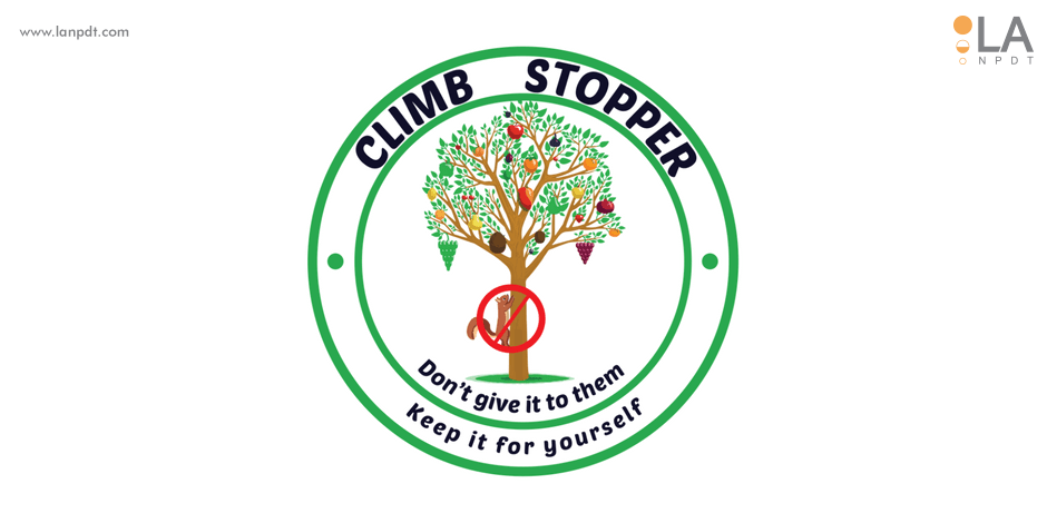
We agreed with the founders early that the logo should carry the benefit visually. In a category nobody searches for by name, the mark is doing the explaining that a brand name normally does.
Our solution
We worked the concepts collaboratively with the owners rather than presenting finished directions in a reveal, which is faster when the client knows the customer better than the designer does.
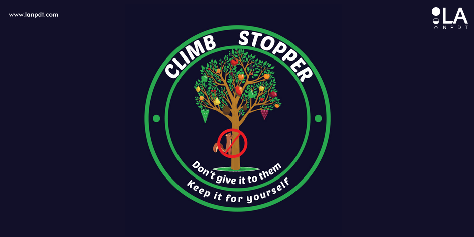
Each direction was tested where the mark actually has to live: reduced to roughly half an inch, flattened to a single colour, and reversed out of a dark ground, before any colour or refinement work went into it. Anything that only worked large was dropped at that stage.
The selected mark was refined into a full production set — full-colour, one-colour and reversed versions in vector formats, with clear-space and minimum-size guidance so packaging printers and label vendors cannot accidentally break it. Design and file preparation were handled by our team in Ruston, Louisiana.
The result
Climb Stopper went to market with one mark running across packaging, the website and marketing material, and a file package their vendors could use without coming back with questions. For a startup at that stage, that consistency is most of what branding has to deliver — the customer sees the same thing on the shelf, on the box and on the site, and reads it as one company.
Product logos have harder constraints than brand logos
A mark that lives on physical product has to survive being moulded into plastic, printed at half an inch and reproduced in a single colour on a carton. Fine strokes, gradients and tight counters disappear at that scale, so the design has to work as a solid silhouette first and gain its colour and detail afterwards. Designers who start in full colour on a white screen routinely deliver marks that fall apart at the first vendor.
Identity work runs best alongside the product itself — see our graphic design work and how it connects to product design when the same team handles the part and the packaging it ships in.
Branding a product startup
1. Let the mark carry the benefit
In a category nobody searches by name, the logo does the explaining a known brand name would otherwise do. Climb Stopper states the function; the mark reinforces it before a word of copy is read.
2. Design for the smallest surface first
The logo lives on labels, cartons and moulded plastic. We design at those sizes first — a mark that holds up debossed on a part works everywhere else.
3. Test in one colour before adding colour
Every direction is flattened to a single colour and reversed out of a dark ground early. Gradients and fine strokes that only work large get cut at that stage, not at the printer.
4. Deliver every variant production needs
Full-colour, one-colour, reversed and icon-only in vector formats, with clear-space and minimum-size rules, so packaging and label vendors cannot break the mark.
| Surface | Constraint |
|---|---|
| Product (moulded/printed) | One-colour, works small |
| Packaging | Legible at shelf distance |
| Instruction sheets | Reproduces in black and white |
| Web | Icon reads at favicon size |
Questions about this project
Straight answers from the engineers who ran the build. Have a different question? Ask us directly.
Talk to an engineerWhat makes logo design for startups with physical products different?
The mark has to survive surfaces a service brand never touches: half-inch labels, one-colour carton print, moulded or debossed plastic. Fine strokes, gradients and tight counters vanish at that scale, so the logo has to work as a solid silhouette before colour is added.
When should a startup invest in a logo?
Once the product is real enough to need packaging, a listing or a launch page. Doing it earlier tends to produce a mark for a product that changes; doing it later means paying rush fees the week cartons have to be ordered.
What files should a logo package include?
Vector masters plus full-colour, one-colour and reversed variants, an icon-only lockup, and written clear-space and minimum-size rules. Without those, printers and label vendors improvise and the brand drifts across surfaces.
Should the logo explain what the product does?
In an unfamiliar category, usually yes. Nobody searches for an electric tree guard by brand name, so the mark carries the explanatory work a recognised name would otherwise do — while still reading as equipment, not decoration.
Can you handle the product and the branding together?
Yes, and it is the cheaper path. When one team designs the part, the packaging and the mark, the identity is tested against real production surfaces as they are decided instead of after tooling is committed.
Other brand, web and video projects
- Modern clean logo design
Minimal wordmark built for small-format packaging.
- Real estate logo design
Identity work for a regional property brand.
- Paula's Super Pickles food logo
Label-first identity for a shelf-stable food brand.
Looking for physical product work instead? See the product development portfolio.