Written by Yelena Rymbayeva, MPhil Communication & Media Studies, BTech Quality Control
Marketing & Product Leader, Technology Commercialization
Published August 10, 2026
A pool company logo has to avoid the wave-and-sun clip art every competitor uses while still reading as competent equipment branding — and it has to hold up small and in one colour.
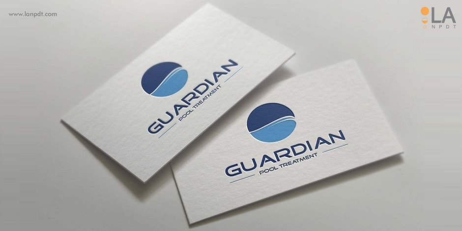
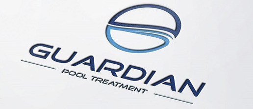
For Guardian Pool Treatment we built a geometric mark around balance, the thing their automation product actually maintains, and refined it into a full usage set for product, print and signage.
Project at a glance
- Client
- Guardian Pool Treatment LLC — pool automation systems
- Scope
- Logo design and core brand identity
- Concept
- Geometric mark derived from the yin-yang symbol: balance and harmony
- Palette
- Blues taken from treated pool water, restrained for equipment branding
- Delivered
- Vector masters, one-colour and reversed lockups, clear-space and size rules
- Applied to
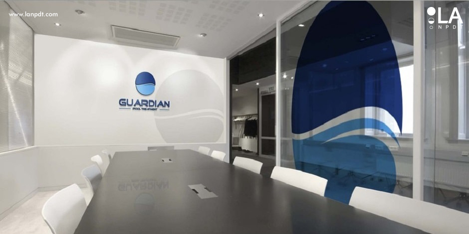
- Product, business cards and stationery, interior signage
The client
Guardian Pool Treatment LLC builds pool automation systems — equipment that measures and corrects pool water chemistry without an owner testing and dosing by hand. The company had the product and needed an identity to put on it, on corporate stationery and eventually on vehicles and signage.
The challenge
A pool company logo usually falls into one of two traps: a literal wave-and-sun clip-art mark that looks like every pool service in the country, or something so abstract it says nothing about the business. Guardian needed neither. Their product is about chemical balance, so the mark had to communicate control and equilibrium — the reason an owner trusts an automated system with a pool they are not testing themselves.
It also had to work as equipment branding. The same mark sits on a controller housing, a business card and a conference room wall, which means it has to survive being small and single-colour long before it gets to be large and full-colour.
Our solution
We built the mark from the yin-yang symbol — balance and harmony, which is literally what the product maintains in the water. Reworked as a geometric form rather than a borrowed symbol, it reads as a modern logo design instead of a spiritual reference, and it keeps a strong silhouette at any size.
The palette came from the product's own environment: the blues of treated pool water, restrained enough to stay credible on technical equipment. Every direction was checked in one colour and reversed out of dark before colour work began, then refined into a complete usage set — vector masters, one-colour and reversed versions, and clear-space and minimum-size rules for print vendors.
The result
Guardian went from no identity to a mark running consistently across stationery, product and interior signage, with the file set their printers and fabricators needed to apply it without improvising. It works as the starting point for the rest of the brand system — packaging, vehicle graphics and web all inherit the same geometry and palette.
What makes a logo still work in ten years
Marks date for predictable reasons: gradient meshes, of-the-moment typefaces and detail that only resolves at poster size. Geometric simplicity is why identities drawn in the 1970s are still in use, and why we design in black and white first — if the silhouette is not strong without colour, colour is hiding a weak idea.
The delivery matters as much as the drawing. A single PNG is not a logo package; vendors need vector masters, one-colour and reversed lockups, favicon crops and written clear-space rules. See our graphic design work, or the Climb Stopper identity for the same discipline applied to a consumer product. Design work is done in Ruston, Louisiana.
What makes a logo work
1. Design in black and white first
If a mark does not work in one color it does not work. Color is added after the silhouette is strong — that is the only way to guarantee it survives embroidery, engraving and fax-quality reproduction.
2. Test at the smallest real size
Most logos are seen as a 16-pixel favicon or a 1cm print mark. Detail that disappears at that size is not detail, it is noise.
3. Avoid whatever is trending
Gradient meshes and hyper-specific typefaces date a brand in three years. Geometric simplicity is what makes marks from the 1970s still usable today.
4. Deliver a real usage set
Horizontal and stacked lockups, one-color and reversed versions, clear-space rules, and vector plus raster files. A single PNG is not a logo delivery.
| Asset | Why you need it |
|---|---|
| Vector master (AI/SVG) | Scales to any size, required by printers |
| One-color version | Embroidery, engraving, single-color print |
| Reversed version | Dark backgrounds and photography |
| Favicon crop | Browser tabs and app icons |
| Clear-space rules | Keeps the mark legible in layouts |
Questions about this project
Straight answers from the engineers who ran the build. Have a different question? Ask us directly.
Talk to an engineerWhat should a pool company logo communicate?
Competence before charm. Owners are trusting a company with equipment, chemistry and an expensive asset, so control and balance are stronger signals than waves, sunbursts and splash graphics that every competitor in the category already uses.
Why design a logo in black and white first?
If the silhouette is not strong in one colour, colour is hiding a weak idea. One-colour is also a hard requirement in practice — embroidery, engraving, moulded parts and single-colour print all strip the palette away.
What belongs in a logo delivery?
Vector masters, horizontal and stacked lockups, one-colour and reversed versions, a favicon crop, and written clear-space and minimum-size rules. A single PNG is not a logo package — vendors will improvise and the mark drifts.
How do you keep a mark from dating?
Avoid whatever is trending. Gradient meshes and of-the-moment typefaces read as a specific year within about three; geometric simplicity is why identities drawn in the 1970s are still in service.
Can the same mark work on product, print and signage?
It has to. We test each direction at the smallest real size and at wall scale before refinement, so the same geometry works debossed on a controller housing, printed on a business card and cut for a conference room wall.
Other brand, web and video projects
- Real estate logo design
Identity work for a regional property brand.
- Paula's Super Pickles food logo
Label-first identity for a shelf-stable food brand.
- Graphic design and logotype work
Logotype exploration and type-led branding.
Looking for physical product work instead? See the product development portfolio.