Our work / Bayou Property Rentals
Real Estate Brand Logo Design
Bayou Property Rentals: a Louisiana identity for a new rental management company
Start a project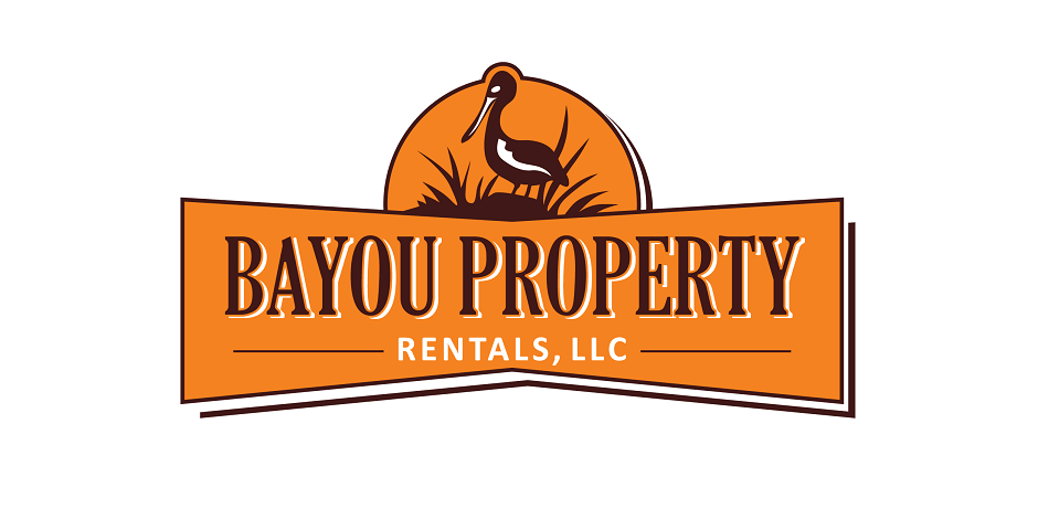

Written by Yelena Rymbayeva, MPhil Communication & Media Studies, BTech Quality Control
Marketing & Product Leader, Technology Commercialization
Published August 10, 2026
A modern real estate logo has to survive every surface in the industry — yard signs at forty feet, business cards at one inch, and a website favicon at sixteen pixels.
This identity was designed around exactly those constraints: a clean mark that reads at sign distance, reproduces in one color, and holds up across print and digital.
Project at a glance
- Client
- Bayou Property Rentals, LLC — rental property management in Morehouse Parish, Louisiana
- Category
- Brand identity for a real estate business
- Starting point
- A newly formed company with no visual identity
- What we delivered
- A modern logo mark and wordmark expressing Louisiana character
- Key constraints
- Regional personality without novelty, legible from a yard sign down to a listing avatar, produced as a clean single-colour silhouette
- Outcome
- The mark became the foundation the company's website design was built on
The client
Bayou Property Rentals, LLC manages rental property in Morehouse Parish, Louisiana. They came to us at the point most local companies do — the business existed, the brand did not. They needed a mark that felt like Louisiana without tipping into novelty, because the same logo has to sit on a rental agreement and be trusted.
The challenge
Two requirements pulled in opposite directions. The mark had to express the character and culture of Louisiana — the reason a local owner picks a local manager — while staying conservative enough for a real estate business, where the brand is a promise about someone else's property and income.
Our solution
Property branding lives at two extremes and almost nowhere in between: large, outdoors and read at a distance, or tiny, on a listing profile or a document header. A mark that only works at one of those sizes fails in daily use, so we designed for the extremes first and let the in-between sizes follow.
- High contrast, so the mark holds up against a photographed exterior rather than a clean white studio background.
- Simple silhouette with open counters, so nothing fills in when it is reduced or printed cheaply.
- A wordmark that stays readable next to the symbol at small sizes instead of competing with it.
- Regional character carried by shape and reference, not by decorative detail that disappears when scaled down.
The result
The finished logo became the foundation Bayou Property Rentals built their website design on — the brand's colour, weight and tone were set by the mark first, then carried into everything the company put in front of a property owner.
What real estate logo design demands
1. Design for the yard sign first
The harshest test in real estate branding is a sign read from a moving car. If the mark works at that distance in one color, everything downstream is easy.
2. Avoid the category clichés
Rooflines, keys and skyline silhouettes make a firm invisible in a market where every competitor uses the same three symbols. Distinctiveness is the job.
3. Build the full lockup system
Horizontal, stacked and icon-only versions, plus agent-name variants. Real estate branding lives in lockups — the logo alone is half the deliverable.
4. Deliver production-ready files
Vector masters, one-color variants, and files named for what they are. Sign shops and printers should never have to call and ask.
| Surface | Constraint |
|---|---|
| Yard sign | Readable at distance, one-color |
| Business card | Holds detail at small size |
| Website / social | Icon works square at 16px |
| Apparel / swag | Embroiders cleanly |
Questions about this project
Straight answers from the engineers who ran the build. Have a different question? Ask us directly.
Talk to an engineerWhat makes a real estate logo work in practice?
It has to survive two extremes: large and outdoors, read at a distance from a moving car, and tiny on a listing profile or document header. That means high contrast, a simple silhouette with open counters, and a wordmark that stays readable beside the symbol rather than competing with it.
Can a logo look local without looking like a novelty?
Yes, but the regional character has to come from shape and reference rather than decorative detail. Detail is the first thing to disappear when the mark is scaled down or cut in one colour, and it is what tips a professional identity into a souvenir.
Other brand, web and video projects
- Paula's Super Pickles food logo
Label-first identity for a shelf-stable food brand.
- Graphic design and logotype work
Logotype exploration and type-led branding.
- New car sticker design
Applied graphics and decal artwork.
Looking for physical product work instead? See the product development portfolio.