Our work / Logotype and Marketing Material for OKGlobal
OKGlobal: Logotype and Graphic Design
OKGlobal: a logotype and stationery system for an oil and gas consultancy
Start a project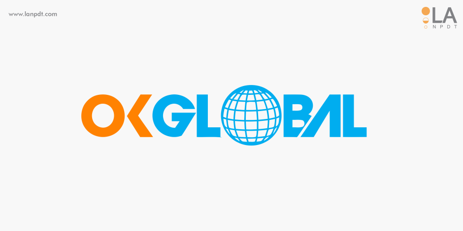
Written by Yelena Rymbayeva, MPhil Communication & Media Studies, BTech Quality Control
Marketing & Product Leader, Technology Commercialization
Published August 10, 2026
A logotype — a brand name drawn as the mark itself — works when the lettering alone carries the personality, with no symbol to lean on.
This project was a custom logotype: letterforms drawn and refined specifically for the name, delivering a mark that is distinctive by construction rather than decoration.
Project at a glance
- Client
- OKGlobal — international quality and production consultancy for oil and gas
- Category
- Branding, logotype and stationery system
- Starting point
- An operating consultancy with no consistent visual identity
- What we delivered
- Logotype, two-colour palette, typography and a full stationery system with usage guidance
- Key constraints
- Credible in an industrial sector, legible in one colour, reproducible by any local printer worldwide
- Outcome
- The mark set the colour scheme for the company website and wider corporate identity
OKGlobal sells judgement — quality systems, production optimisation, audits — to operators who buy on credibility. The identity had to look like a firm an oil and gas company would let inside its plant, and it had to reproduce identically on a proposal cover in one country and a business card in another.
The client
OKGlobal, an international consulting firm specialising in quality control, production optimisation and Quality Management Systems for oil and gas companies.
The challenge
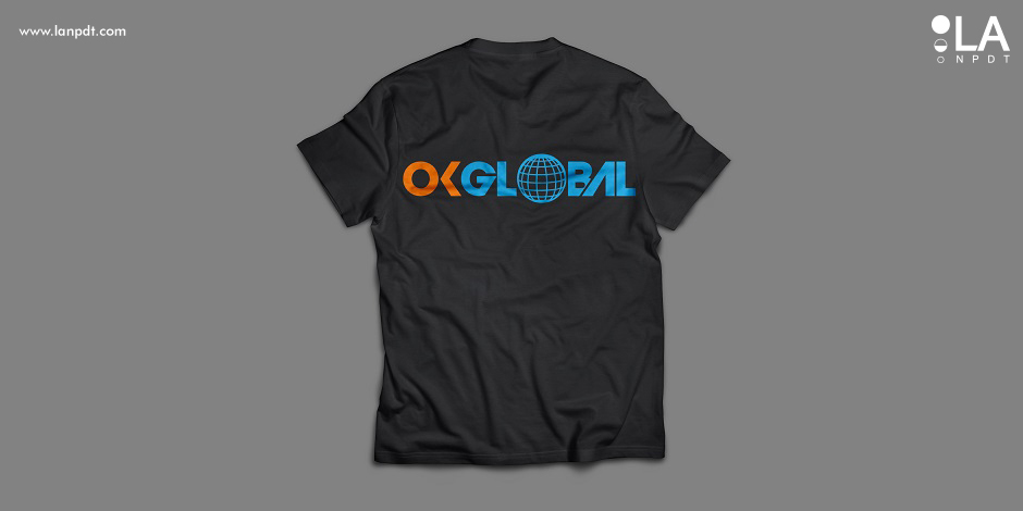
Create a logotype and marketing materials that read as international and technically serious without falling into the two clichés of the sector — a derrick silhouette or a generic swoosh. The mark also had to work in the least forgiving places a consultancy uses it: a fax-grade black-and-white document header, an embroidered polo, and a proposal cover printed by whichever local shop the client happened to use.
Our solution
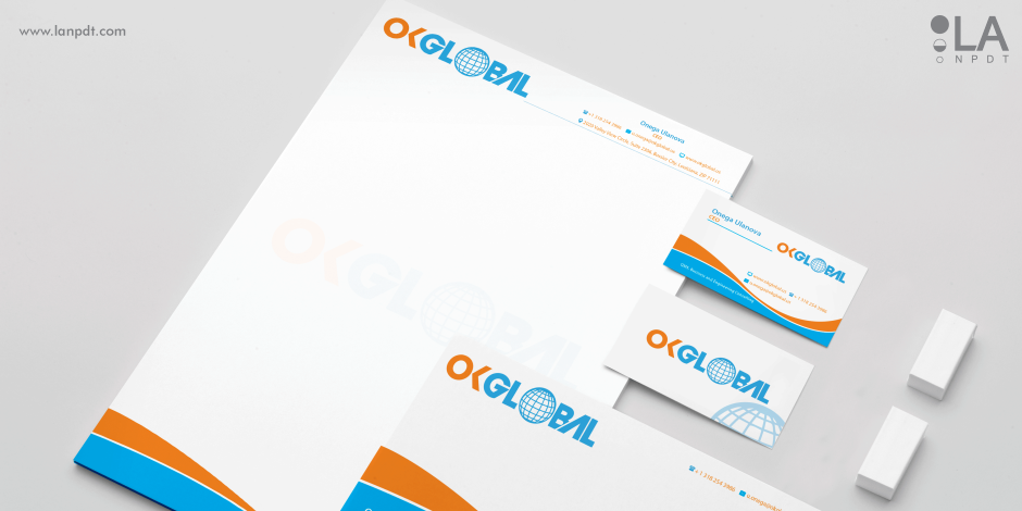
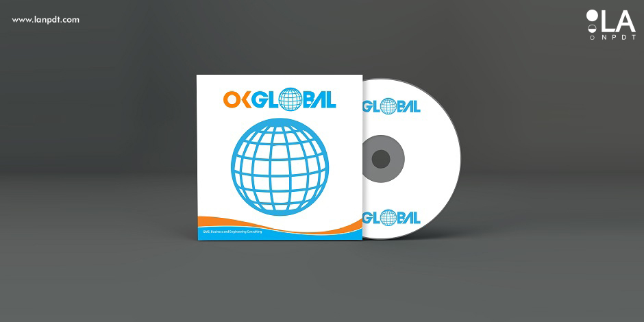
The firm works across borders, so the mark is built on a globe with curves wrapping it — motion around a fixed point, which is what a consultancy actually does. The palette is deliberately narrow and high contrast: blue for standards and reliability, orange for the energy and momentum the consulting work is bought for. Two colours keep print costs predictable and keep the mark legible when it drops to one.
- A globe-and-curve mark with open counters that survive being embroidered or printed small
- A two-colour palette with defined one-colour and reversed versions for documents and signage
- Typography paired with the wordmark so headings and body copy in proposals stay on-brand
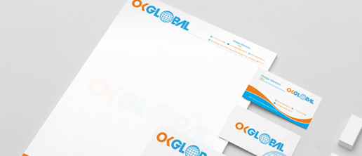
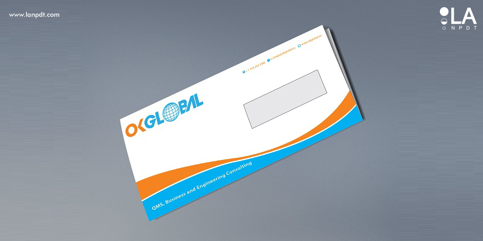
- A stationery system — letterhead, envelopes, business cards, folders — laid out on the same grid
- Vector masters and usage guidance handed over so any printer can reproduce the identity correctly
The result
The logotype became the anchor for everything else: the colour scheme of the company website and the wider corporate identity were both derived from the mark rather than decided separately. That is the practical value of doing the identity first — every later decision has a reference to match instead of a debate to repeat.
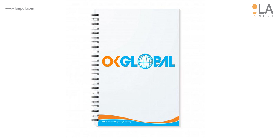
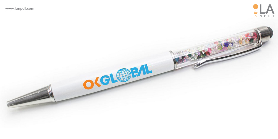
Logo and identity at a glance
| Scope | Logotype design, mark, color system, typography, usage guidelines |
|---|---|
| Applications | Signage, apparel, packaging, vehicles, digital, print |
| Deliverables | Vector logo files, favicon set, brand guidelines PDF |
| Typical timeline | 3-6 weeks |
A logo has to survive every place it lands
Most logos look fine in a presentation and fall apart embroidered on a cap, etched on a machined part or shrunk to a favicon. We test directions at those extremes before choosing, so the final mark works at 16 pixels and on the side of a truck.
Our process
- Discovery on positioning, competitors and where the mark will appear
- Broad exploration in black and white before any color
- Refinement of the strongest direction with real applications
- Color, typography and layout rules that keep usage consistent
- Full file package plus written guidelines
Frequently asked questions
How much does custom logo design cost?
Logo and basic identity packages typically run $1,500-$8,000; full brand systems run higher.
How many concepts do we see?
Usually three to five developed directions, then revision rounds on the chosen one.
Do we own the artwork?
Yes - full rights and source files transfer to you on completion.
Capabilities used on this project
Rapid prototyping services
3D printing, CNC machining, urethane casting and functional prototype builds with published materials, tolerances and lead times.
When a logotype is the right choice
1. Choose type-as-mark for name-driven brands
When the name is the brand — common for professional services and founders — a logotype puts all the recognition into the word itself. No symbol competing for memory.
2. Customize the letterforms, don't just pick a font
A typeset name is a font anyone can buy. A logotype modifies terminals, ligatures and spacing so the word is ownable — the difference is subtle and entirely the point.
3. Test at the extremes of size
Logotypes fail small before they fail big. We proof at favicon and embroidery sizes early, and simplify details that disappear.
4. Pair with a restrained system
A logotype needs a supporting cast — color, secondary type, spacing rules — so everything around the word reinforces it instead of competing.
| Mark type | Best for | Trade-off |
|---|---|---|
| Logotype (wordmark) | Name-driven brands | Weaker at tiny sizes |
| Symbol + name | Long or generic names | Two things to recognize |
| Monogram | Long names, personal brands | Requires established awareness |
Questions about this project
Straight answers from the engineers who ran the build. Have a different question? Ask us directly.
Talk to an engineerHow much does logotype design cost?
A custom logotype typically runs $1,500 to $6,000 depending on revision scope and whether a full identity system is included.
What is the difference between a logotype and a logo?
A logotype is a logo built from the name's letterforms — think of brands recognized by their lettering alone. A symbol logo is a separate graphic mark.
How long does logotype design take?
Two to four weeks including concepts and refinement rounds.
What should a B2B identity avoid in a technical sector?
The category shorthand. In oil and gas that means derricks, pipelines and generic swooshes — symbols every competitor already uses, which make a firm invisible in exactly the moment a buyer is comparing shortlists.
What files do you hand over with an identity?
Vector masters, one-colour and reversed versions, colour specifications for print and screen, typography rules, and stationery artwork ready to send to a printer without further design work.
Other brand, web and video projects
- New car sticker design
Applied graphics and decal artwork.
- 3D architectural rendering
Photoreal interior and exterior visualisation.
- Architectural rendering company project
Rendering set produced for a building programme.
Looking for physical product work instead? See the product development portfolio.