User Centric Design: Methods That Prevent User Error
User centric design is a set of methods, not a philosophy. Here is what each method costs, what it reveals, and how to design user error out of a product.
December 31, 20255 min read

Written by Konstantin Dolgan, Ph.D., NPDP
Founder & CEO, Product Development Engineer
Published December 31, 2025Updated September 2, 2026
User centric design is a set of methods with costs and outputs, not a value statement in a pitch deck. Either someone watched real people use the product and changed the design because of what they saw, or they did not. When a product is described as suffering from "user error", the usual diagnosis is that the design made the wrong action easy and the right action unclear.
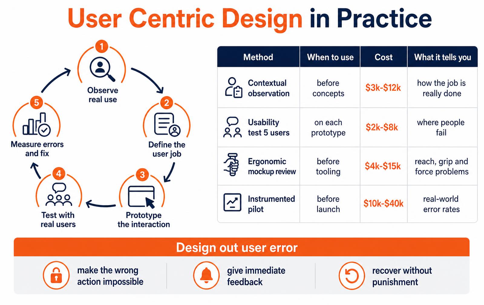
The loop that makes it work
- Observe real use. In the actual environment, with the actual gloves, lighting, noise and time pressure. Interviews collect opinions; observation collects behaviour.
- Define the user job. One sentence about what the person is trying to accomplish, and the conditions they do it under. This becomes the acceptance test for every concept.
- Prototype the interaction. Foam, cardboard and clickable mockups are enough to find most problems, and cost nothing to throw away.
- Test with real users. Five people surface most usability issues. Watch them fail silently rather than explaining what you intended.
- Measure errors and fix. Count task failures, time to complete and recovery rate. Those numbers, tracked across rounds, are the evidence the design improved.
Methods, timing and cost
Method | When to use | Typical cost | What it tells you |
|---|---|---|---|
Contextual observation | Before concepts exist | $3k-$12k | How the job is really done, including workarounds |
Usability test with 5 users | On every prototype round | $2k-$8k | Exactly where people fail and why |
Ergonomic and anthropometric review | Before tooling | $4k-$15k | Reach, grip, force and posture problems |
Task and error analysis | For safety-critical steps | $5k-$20k | Which errors are likely and how severe |
Instrumented pilot | Before full launch | $10k-$40k | Real-world error rates and unused features |
Every one of these is cheaper than a tooling change, and dramatically cheaper than a recall. Our product discovery service runs the research phases, and rapid prototyping produces the test articles the sessions need.
Designing user error out of the product
Error type | Design response | Example |
|---|---|---|
Wrong part fitted | Physical constraint that only allows one orientation | Asymmetric connector or keyed housing |
Step skipped | Sequence enforced by the interface | Cover cannot close until the module seats |
Wrong control pressed | Separation, shape coding and guarding | Recessed stop button, distinct texture |
Silent failure | Immediate unambiguous feedback | Audible click plus indicator state change |
Unrecoverable mistake | Undo and safe defaults | Confirm-and-revert instead of permanent action |
The hierarchy is consistent across industries: make the wrong action physically impossible first, warn only when you cannot design it out, and treat training and labelling as the last resort rather than the plan. In regulated categories this is formalised as usability engineering, and the same logic pays off in consumer products through fewer returns and support calls.
Frequently asked questions
What is user centric design?
User centric design is an approach where design decisions are driven by observed user behaviour rather than assumptions. In practice it is a loop: observe real use, define the user job, prototype the interaction, test with real users, then measure errors and iterate. The evidence it produces — task failure rates, completion times, recovery rates — is what separates it from stated intent.
How much does user research cost in product development?
Contextual observation typically costs $3,000-$12,000, a usability test with five users $2,000-$8,000 per round, an ergonomic review $4,000-$15,000, task and error analysis $5,000-$20,000, and an instrumented pilot $10,000-$40,000. All of these are far cheaper than a tooling change after production starts.
How do you design a product to prevent user error?
Work down a hierarchy. First make the wrong action physically impossible through constraints such as keyed connectors and enforced sequences. Then provide immediate, unambiguous feedback so mistakes are noticed instantly. Then make recovery easy with undo and safe defaults. Only after those should you rely on warnings, labelling and training.
Want the design tested before tooling?
We run observation, usability sessions and ergonomic reviews on real prototypes, then fix what the sessions expose.
What user centric design actually commits you to
User centric design is not a styling preference or a research phase you schedule once. It is a commitment to let observed human behaviour override internal assumptions whenever the two disagree — including late, when changing a housing is expensive.
On physical products that commitment shows up in three places: the geometry a hand has to work with, the sequence a task forces the user through, and the feedback the product gives when something has gone wrong.
Teams that treat it as a checkbox produce products that test well in a conference room and fail in a warehouse, an operating theatre or a kitchen. The difference is almost never intelligence; it is that the design encoded a mental model the user does not share.
Classify the error before designing the fix
Human error is not one phenomenon. James Reason's distinction between slips, lapses and mistakes matters because each type responds to a completely different intervention. Applying the wrong remedy — usually a warning label — is the most common failure we see in ergonomic reviews.
Error type | What happened | Typical cause | Design fix that works | Fix that does not |
|---|---|---|---|---|
Slip | Right intention, wrong action | Similar adjacent controls, muscle memory | Separate, shape-code or recess the controls | Larger label |
Lapse | Step forgotten | Interruption, long sequence, no state cue | Persistent state indication, forced sequence, physical interlock | Training reminder |
Mistake | Wrong intention | Bad mental model of how the product works | Change the model: mapping, naming, visible cause and effect | More documentation |
Violation | Deliberate shortcut | Correct path is slower or harder | Make the safe path the fastest path | Policy warning |
Perception error | Signal missed | Low contrast, noise, glove or PPE use | Redundant coding: visual plus tactile plus audible | Brighter LED alone |
Anthropometrics: design to the population, not to the team
Most grip and reach failures come from designing around the bodies in the room. The standard practice is to accommodate the 5th through 95th percentile of the target population for reach and clearance, and to check the extremes separately: clearance dimensions are set by the largest user, reach dimensions by the smallest, and force limits by the weakest expected operator.
Dimension | Design driver | Common working figure | What breaks if you ignore it |
|---|---|---|---|
Handle diameter, power grip | Adult hand breadth | 30-45 mm | Fatigue, dropped tool, reduced torque |
Button spacing, gloved use | Fingertip width plus glove | 19 mm minimum centre to centre | Adjacent-key slips |
One-handed activation force | Weakest expected operator | Under 20 N sustained | Two-handed workaround defeats guarding |
Display viewing distance | Character height ratio | Height ≈ distance / 200 | Misread values, transcription errors |
Overhead reach | 5th percentile female stature | Under 1,800 mm | Stools, ladders, unsanctioned climbing |
Control layout rules that remove slips before testing
- Map controls spatially to what they affect — burners, axes, and zones should sit in the same relative arrangement as the thing they command.
- Shape-code and colour-code any two controls whose confusion has a safety or scrap consequence; never rely on labels alone under gloves, low light or urgency.
- Give every state a physical or persistent visual cue. If a user can leave the product in a hazardous state with no indication, the product will be left that way.
- Use interlocks for sequences that cannot be reordered, and detents or resistance for settings that must not drift.
- Design for interruption: assume the operator is pulled away mid-task and must resume without re-deriving where they were.
- Prefer irreversible actions to be deliberate — recessed, two-step or held — and reversible actions to be immediate.
A usability protocol you can run in one week
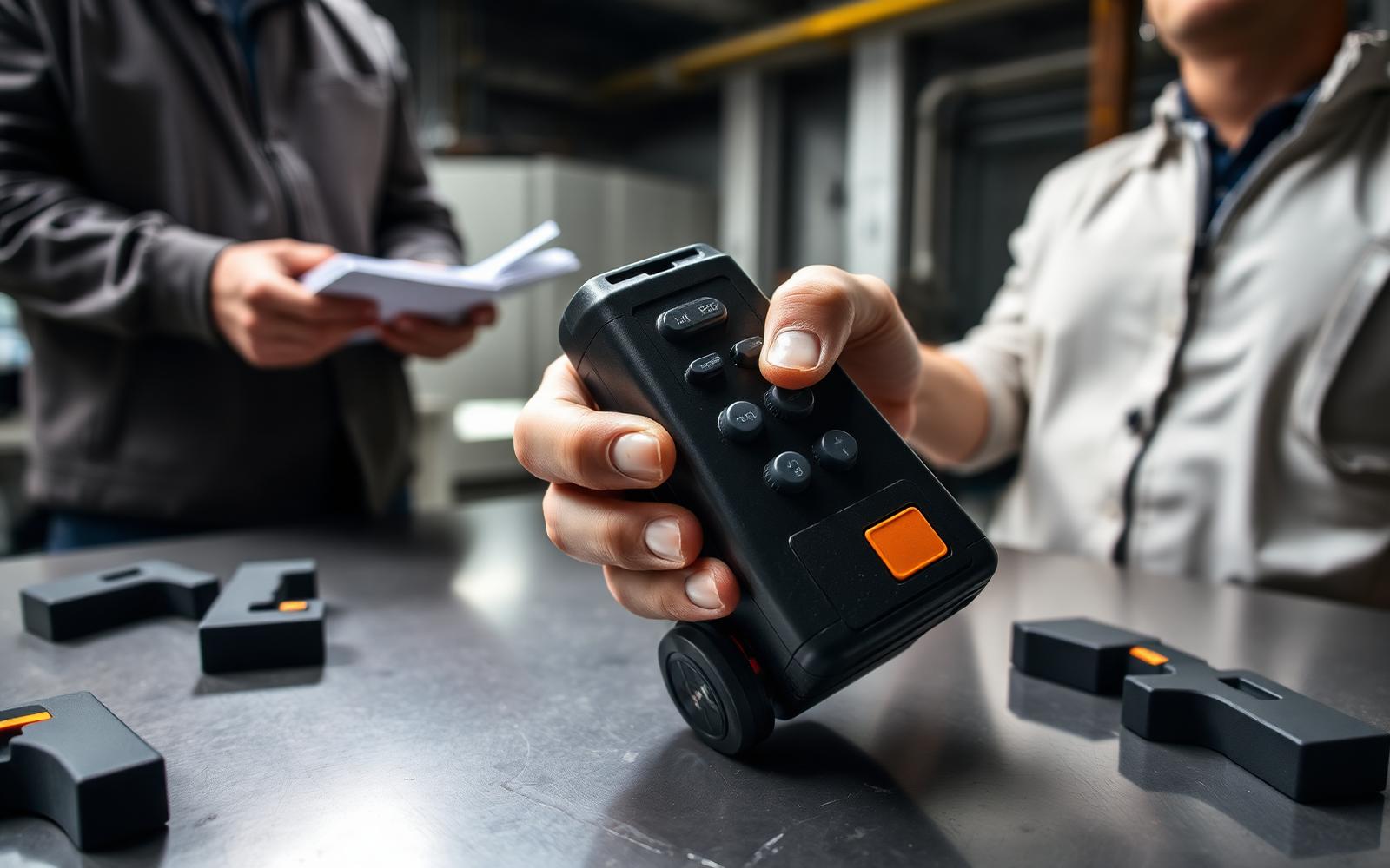
You do not need a formal human factors lab to catch the majority of use errors. Five to eight participants from the actual user population, working through realistic tasks with representative prototypes, will surface most of what a full study finds — provided you observe behaviour rather than collect opinions.
Day | Activity | Output |
|---|---|---|
1 | Define 5-8 critical tasks and their failure consequences | Task list with severity ranking |
2 | Build or dress prototypes to the fidelity the task needs | Testable articles, including a distractor variant |
3-4 | Run sessions: think-aloud, no coaching, video the hands | Timed task records, error log |
5 | Classify every error by type, not by participant | Slip/lapse/mistake table |
6 | Rank by severity x frequency, assign design fixes | Prioritised change list |
7 | Re-test the top three fixes with foam or printed variants | Confirmed or rejected fixes |
Two rules make the difference between a study that changes the design and one that comforts the team: never explain the product before the task, and count errors rather than asking whether the product was easy to use. Self-reported ease correlates poorly with observed failure.
Pre-release use-error checklist
- Every hazardous state has a cue detectable without looking directly at the product.
- No two controls with different consequences share shape, size and position class.
- Force, reach and grip verified against the 5th and 95th percentile of the actual population, not the team.
- Tested with the PPE, lighting and noise conditions of the real environment.
- Every observed use error has a documented fix or a documented, justified acceptance.
- Labels are the last line of defence, never the primary control for a severe hazard.
Frequently asked questions
What is user centric design in hardware?
It is a development approach where observed user behaviour — reach, grip, sequence, error patterns — governs the geometry and interaction of a physical product, and where conflicts between user evidence and internal preference are resolved in favour of the evidence.
How many people do you need for a usability test?
Five to eight participants per distinct user group catches the large majority of usability problems. Add a second round after fixes rather than a single larger round; iteration finds more than sample size.
Does ergonomics slow development down?
Front-loaded, no. Grip, reach and control layout decisions cost hours in CAD and days in foam, versus the tooling changes and field complaints that follow a housing designed without them.
Can warnings substitute for a design change?
Only as the lowest tier of the hazard hierarchy. Eliminate, then guard, then interlock, then warn. A warning that competes with a faster unsafe path loses. Work with LA NPDT: if you are moving from here to execution, start with our product design services or talk to us about concept design services .
Filed under:EducationUncategorized
Tagged:2025
Services related to this guide
- Best industrial design firmsWhich studios take an idea from form to manufacturable hardware, and what they charge.
- Product design servicesIndustrial design and CAD taken all the way to manufacturable files.
- Prototype designLooks-like, works-like or pre-production: what each proves and what it costs.
- Product development examplesReal projects we designed, prototyped and shipped.